Responsive Design
Responsive design is how an interface adapts to the device it's shown on, so that every user can read content comfortably and tap targets accurately, whatever their screen or input method. It is an accessibility requirement, not a visual nicety.
Breakpoints
The design system defines a set of standard breakpoints that drive most responsive behavior. Using these breakpoints promotes consistency across application. Each breakpoint corresponds to a flag returned by useResponsiveLayout, allowing components to respond to viewport changes in a consistent way.
| Mode | Viewport width | Flag |
|---|---|---|
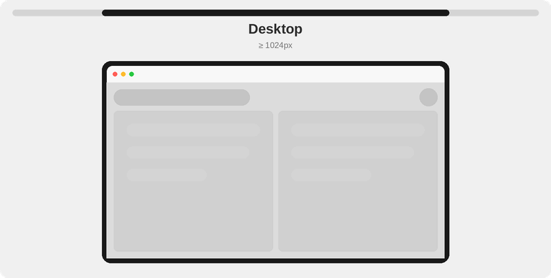
| Desktop | 1024px and above | isDesktop |
| Tablet | 768px to 1023px | isTablet |
| Mobile | 767px and below | isMobile |
Responsive patterns
The guiding rule is simple: a smaller screen gets a larger, touch friendly version of the same interface. Most things scale up one size, and a few floating elements like dialogs and menus become bottom sheets on Mobile.
Touch interfaces require larger controls and text because fingertips are less precise than pointers. WCAG asks for touch targets of at least 24px (level AA) and 44px at its strictest level (AAA); Apple recommends 44px and Material 48px.
1. Scaling
Most elements scale up one size from Desktop on Tablet and Mobile. If something is already at its largest size, it stays there, so nothing becomes oversized.
| Element | Desktop | Tablet and Mobile |
|---|---|---|
| Body text | 12px | 14px |
| Icons | 16px | 20px |
| Button | Small or Standard | Up one size (Large is the cap) |
| Inputs, SelectMenu, FilterMenu, Combobox | Standard | Large |
The design system applies these steps automatically inside most of its own components. For primitives, they must be applied manually (covered below).
2. Bottom sheets on Mobile
Dialogs and menus that float on Desktop drop to a bottom sheet on Mobile, so they sit within thumb reach. On Tablet they keep their floating shape but their contents scale up. This covers Modal, the menu dropdowns of SelectMenu, FilterMenu, and Combobox, and Tooltips when they are set to adapt.
Responsiveness handled by the design system
Most components manage responsiveness automatically. The components below are notable because they change layout or expose responsive options.
| Component | What changes | How to control |
|---|---|---|
| Modal | Becomes a bottom sheet on Mobile | Set mobileFriendly={false} to keep the centered dialog |
| SelectMenu, FilterMenu, Combobox | Dropdown becomes a bottom sheet on Mobile | Set mobileFriendly={false} to keep the popover |
| DropdownMenu | Becomes a bottom sheet on Mobile, with taller rows (48px) | Set mobileFriendly={false} to keep the popover |
| Tooltip | Becomes a dialog on Mobile and Tablet, or hides on Mobile | Opt in with shouldAdaptToViewport, or visibilityHiddenInMobile to hide it |
| AlertModal | Action buttons scale up to large on Tablet and Mobile | Always on, no toggle |
| Page Header | Switches to the Mobile variant | Always on, no toggle |
| SelectCard | Orientation and input position change on Mobile | Configure with orientationForMobile |
Beyond these, most higher-level components quietly scale their own text, icons, and spacing at the Desktop breakpoint with no setup, including Alert, Badge, Tag, Snackbar, StatusPanel, Accordion, Counter, MenuItem, and the menus above. If you use the component, you get its responsive sizing for free.
How to handle responsiveness manually
The primitives you compose yourself do not scale on their own: Button, TextInput, Icon, and any Text or Heading you write. Read the breakpoint with useResponsiveLayout and set their size or classes from it.
Component sizes
Button (small, standard, large, xLarge) and inputs (standard, large) do not scale on their own. Set the size prop from the breakpoint.
const { isDesktop } = useResponsiveLayout();

return <Button size={isDesktop ? 'standard' : 'large'}>Continue</Button>;
const { isDesktop } = useResponsiveLayout();

return <TextInput label="Email" size={isDesktop ? 'standard' : 'large'} />;
Icon sizes
Icon takes a string size ('16', '20', '24', '32', '40'). Scale it the same way.
const { isDesktop } = useResponsiveLayout();

return <SearchIcon size={isDesktop ? '16' : '20'} />;
Typography
Type is set with utility classes, not a prop. Author mobile-first: the larger (Mobile) size is the base, and you step down on lg (1024px and up, Desktop).
// Body: 14px on Mobile and Tablet, 12px on Desktop
<Text className="text-body-14 lg:text-body-12">Booking confirmed</Text>
// Heading: 16px on Mobile and Tablet, 14px on Desktop
<Heading className="text-heading-16 lg:text-heading-14">Your bookings</Heading>
Tailwind's md (768px) and lg (1024px) prefixes line up with the Tablet and Desktop breakpoints, so md: and lg: classes stay in step with isTablet and isDesktop.
Inside a WebView (large tablets)
When a web app is loaded inside a native WebView on a tablet wider than 1024px, it would normally be treated as Desktop and pick up the smaller scale. To force the touch scale in that context, raise the tablet breakpoint to a very large value (for example 9999) in both your Tailwind screens configuration and ResponsiveLayoutProvider, so every width below it resolves to Tablet.
<ResponsiveLayoutProvider breakpoints={{ mobile: 767, tablet: 9999 }}>
  <App />
</ResponsiveLayoutProvider>
See Customizing breakpoints with the provider for the full example.